Livening up your layouts with CSS Editor
You've been wishing for ages for an easier way to make a few changes to your site without the expert-level skillset and developer set-up necessary to do your own sub-theming. SiteFarm 5.0.0 introduces CSS Editor, your built-in solution for not just simple style updates, but full-on layout changes to blocks in your content region.
Why the CSS Editor?
One of our lead developers, Mark Miller, has kept a close eye on the Layout Builder initiative undertaken by the Drupal community. While the project has made great advances, the direction of the project thus far has introduced potential conflicts with our SiteFarm model, and so we're waiting to see these issues addressed before adopting it. Happily, we can offer a different solution for layout building right inside of the CSS Editor.
1. How to get started
The CSS Editor can only be accessed by a user with the Site Manager role. We have the how-to steps for using the CSS Editor interface in our training documentation for managers, which we strongly recommend you review if you haven't already.
2. Learn CSS Grid Layout
If you're not already familiar with CSS Grid Layout syntax, this will be essential reading to make your layouts happen successfully. While you can search online for tutorials, here are a few resources to help get you started:
- W3Schools.com (code write-ups)
- CSS Tricks - "A Complete Guide to Grids" (primers and examples)
- Grid by Example (codepen examples, videos, how-tos)
Grids can be simple, or you can go crazy wild and make it very complex, but do check out the CodePen examples in the Grid by Example site to get some ideas of what's possible with this very flexible selection of CSS code.
3. Identify the needed IDs and Classes
Locate the names of the IDs and classes you'll need so you can target your CSS appropriately. Will this apply to the entire site? Proceed as normal. Do you want to target something specific? Check the training documentation or refer to our quick list here as a refresher:
- Homepage: .path-frontpage
- A single page: .node-#
- An entire content type: check the body tag for the name of the content type. Example: .page-node-type-sf-article
- Target the content region: .region-<name> example: .region-content
- A block: #block-<blockname>
- Views: .path-{view-name}, can be located in the page's body tag
4. Create your Grid container
You'll need to structure your grid container. Here are a couple of starter examples:
Targeting the content region of page 10:
.node-10 .region-content {
display: grid;
grid-template-columns: repeat (12, 1fr);
grid-gap: 10px;
}
Targeting the footer region of every Article page type on the site:
.page-node-type-sf-article .region-footer-credits {
display: grid;
grid-template-columns: repeat (6, 1fr);
grid-gap: 10px
}
5. Target specific blocks
Define your layout within the grid. There are several ways to accomplish this—named grids, spans, cols/rows—but once you decide the best approach for your grid layout, you'll want to structure your CSS like so to affect specific blocks:
#block-<block name> {
<parameters>
}
Example:
#block-mhscientistsdiscovernewebolavirus {
grid-column: 11 / span 2;
grid-row: 2;
}
SiteFarm Demo
Take a look at a quick version using CSS Grid Layout to achieve an alternate layout in the Content region using the main content block along with several basic blocks.
Example Mock-up Grids
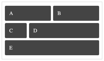
These mock-up examples are provided by Grid by Example and represent only a small portion of the possibilities available using CSS Grid Layout:
- A. Varied column widths

- B. A grid nested within a grid

- C. Row and column spans
